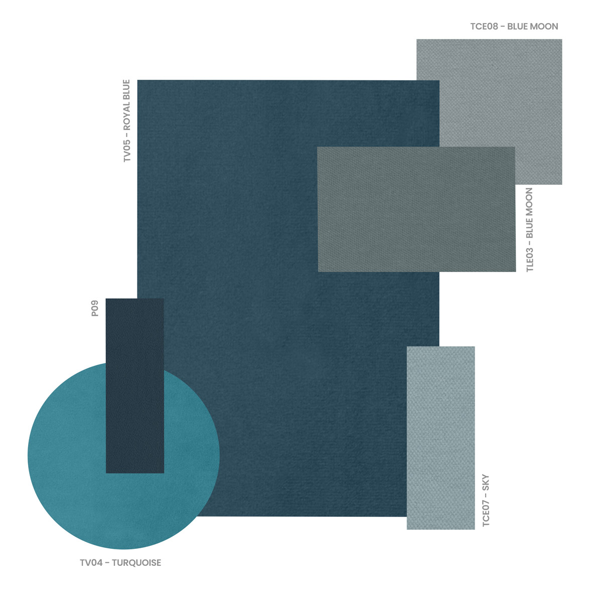
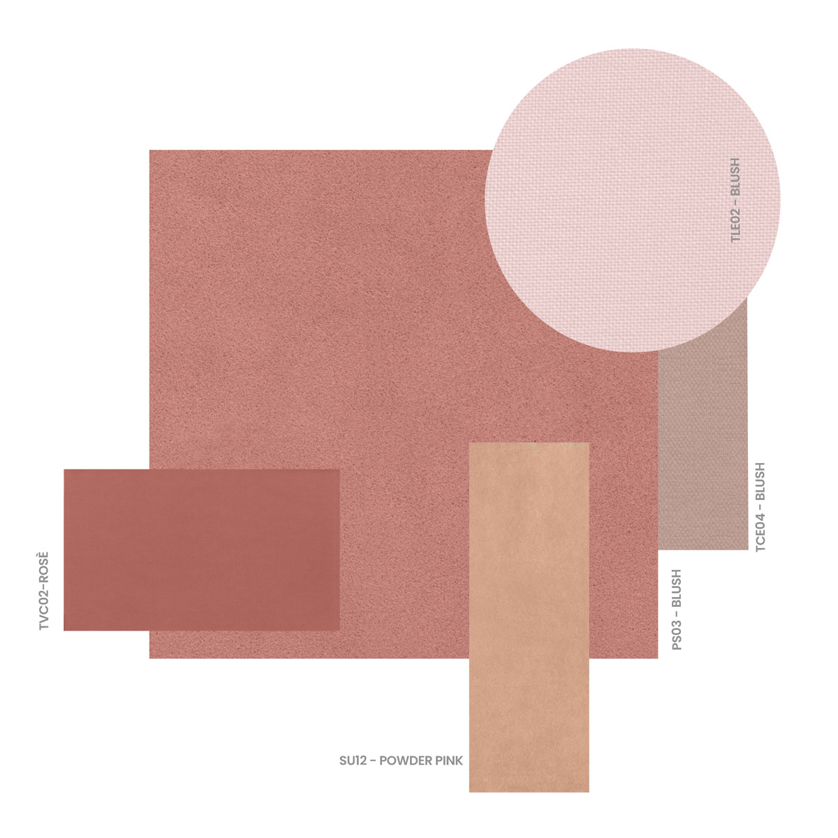
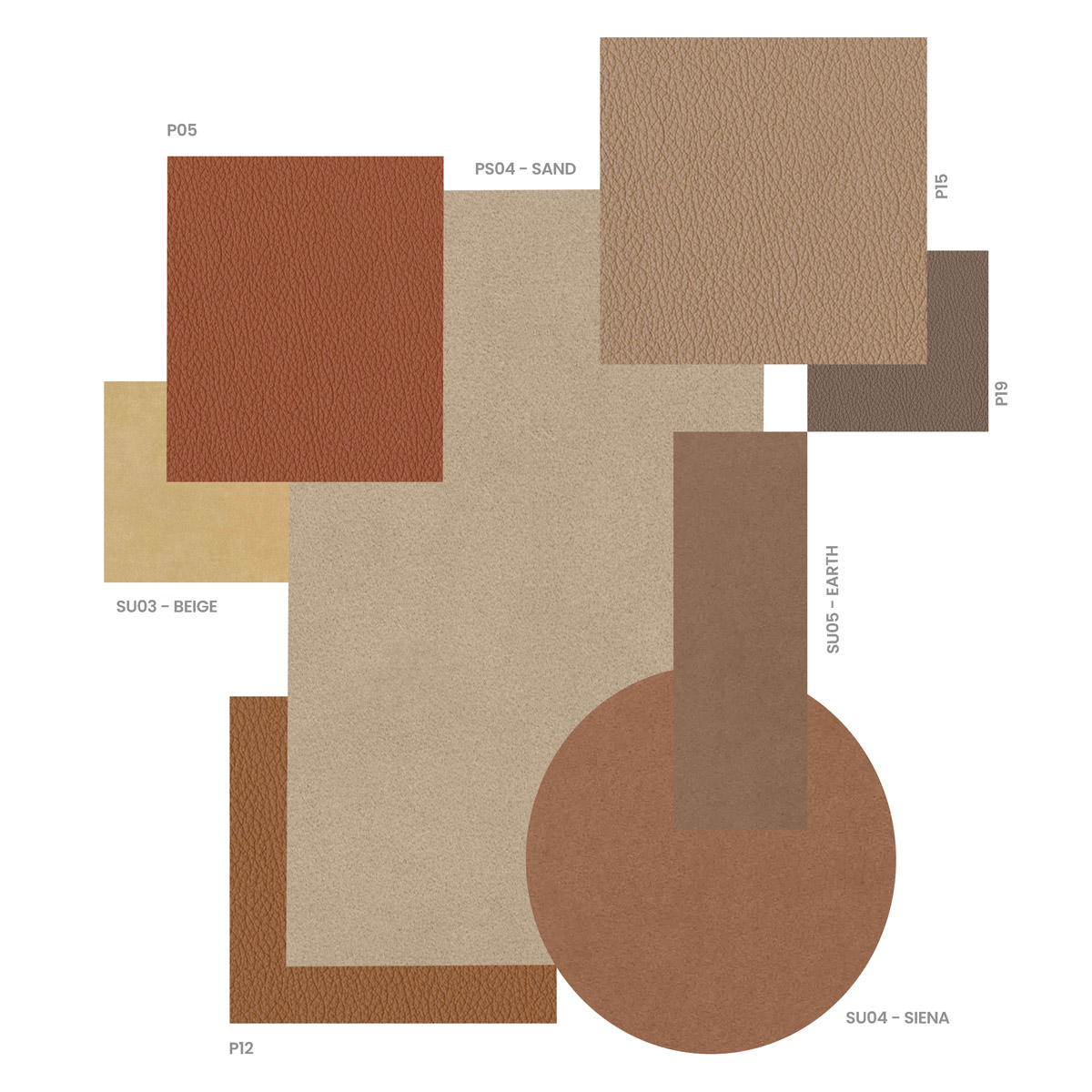
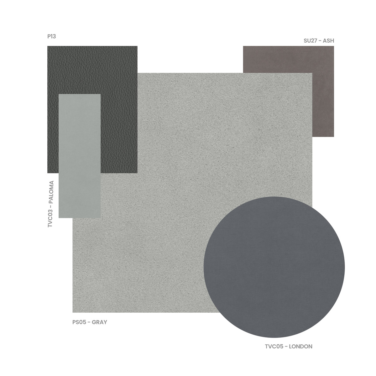
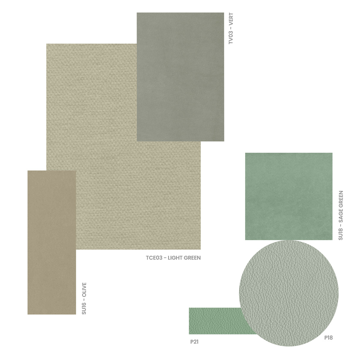
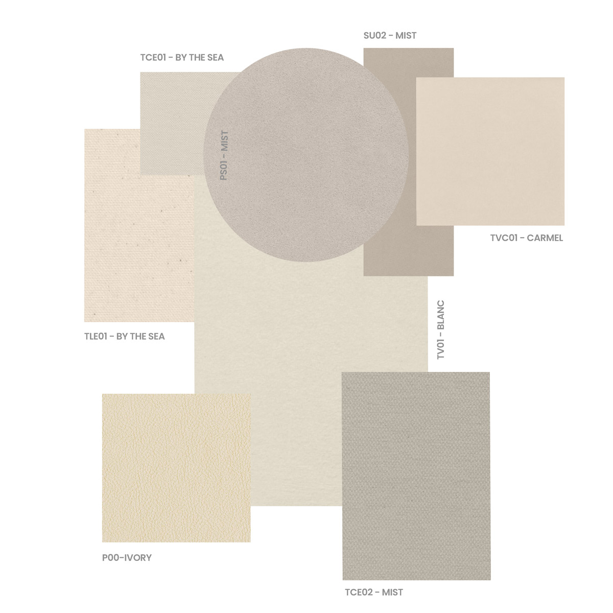
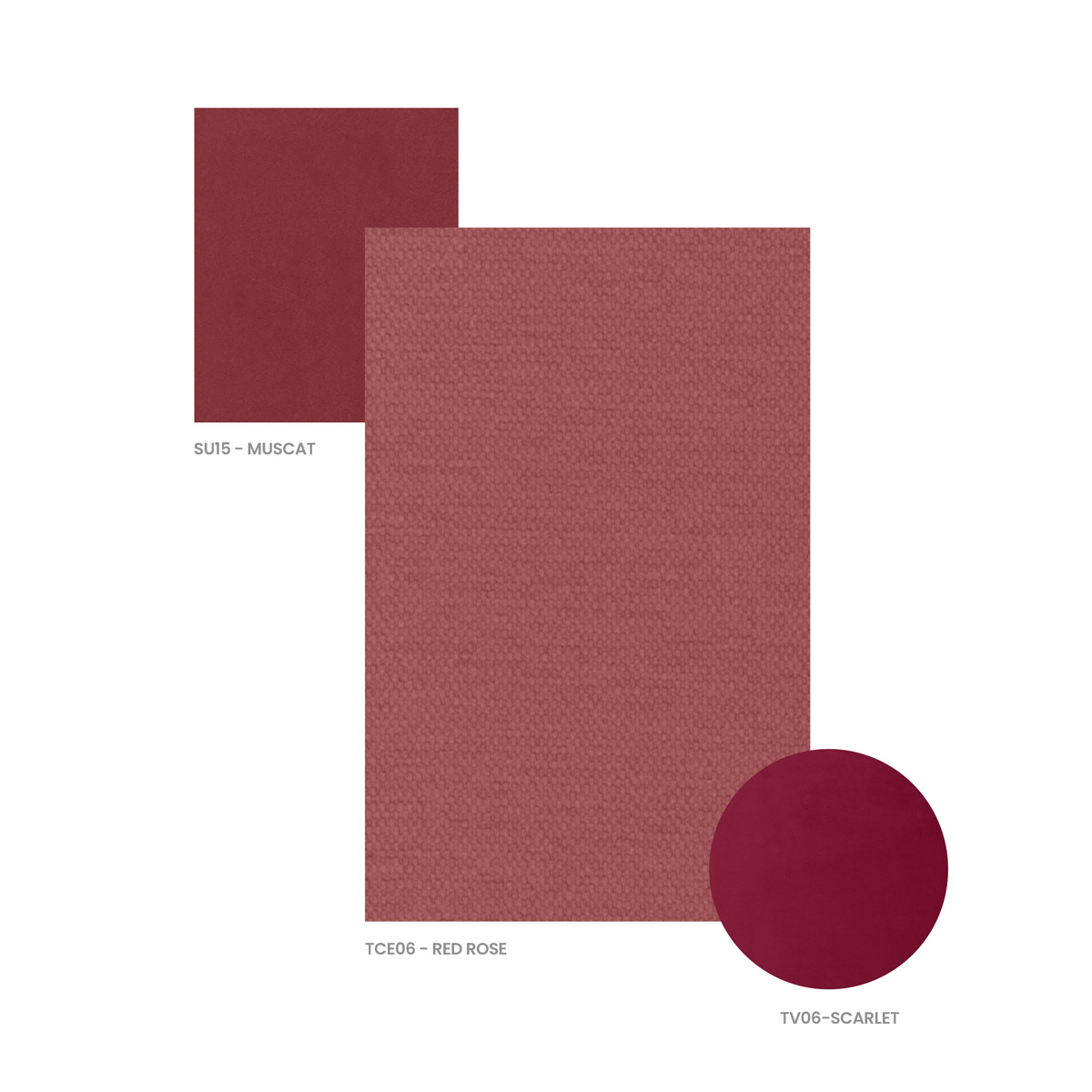
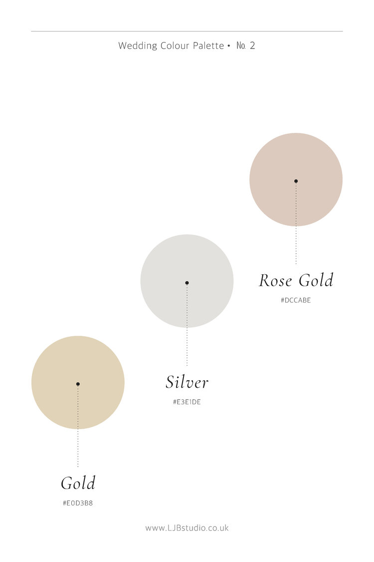
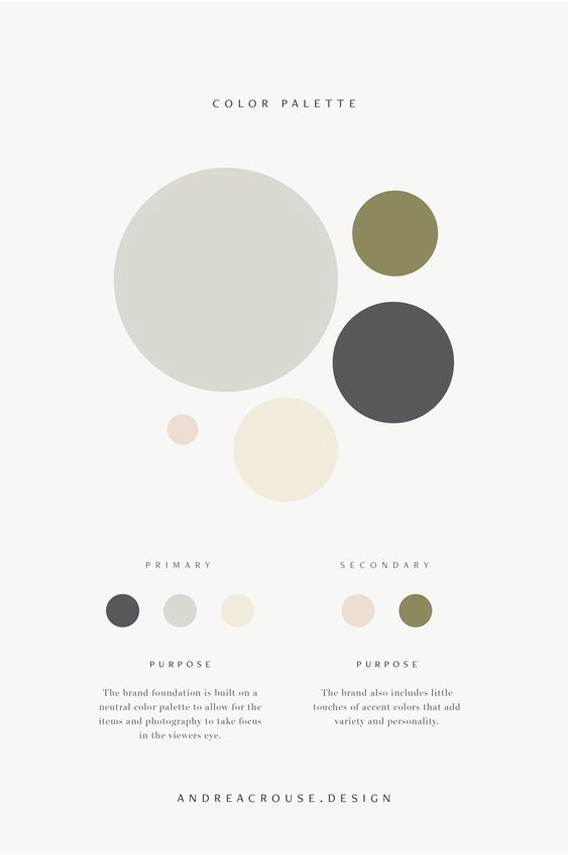
Colour palettes play a pivotal role in finding the perfect match when creating a wedding book. With their ability to evoke emotions and set the tone, colour combinations can transform a collection of photographs into a cohesive and visually appealing narrative. Selecting the right colour palette ensures that the book captures the essence of the wedding day, reflecting the couple’s personality and style. Whether it’s a soft and romantic pastel palette or a vibrant and bold scheme, the colours chosen can enhance the overall aesthetic and create a harmonious visual experience. From coordinating the book’s cover design to selecting complementary hues for backgrounds and borders, a thoughtfully curated colour palette brings harmony and elegance to the wedding book, creating a treasured keepsake that beautifully encapsulates the couple’s special day.
POPULAR COLOUR PALETTES
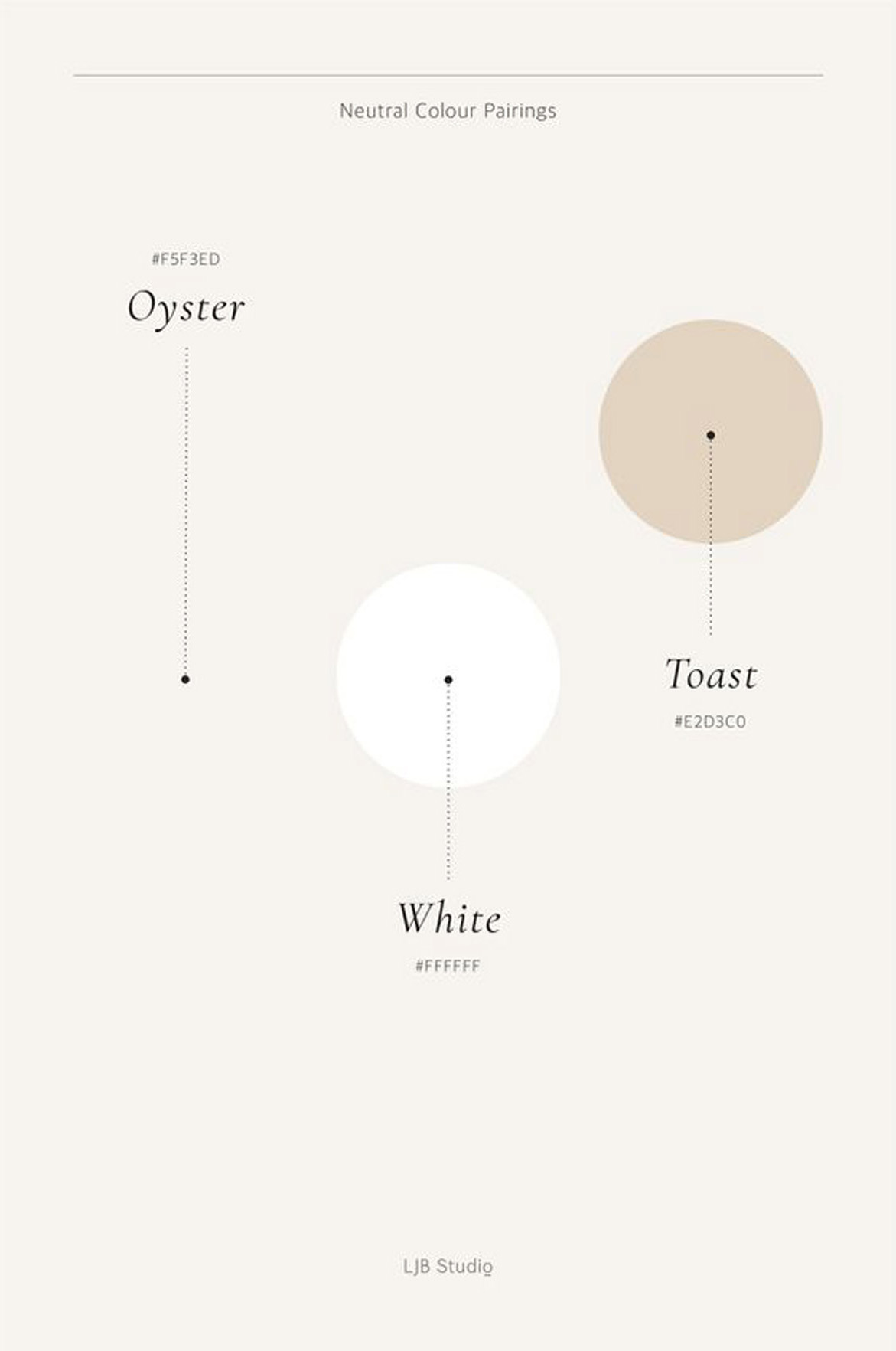
PANTONE Trend Report
The Autumn/Winter 2023/2024 LFW
Colour Palette
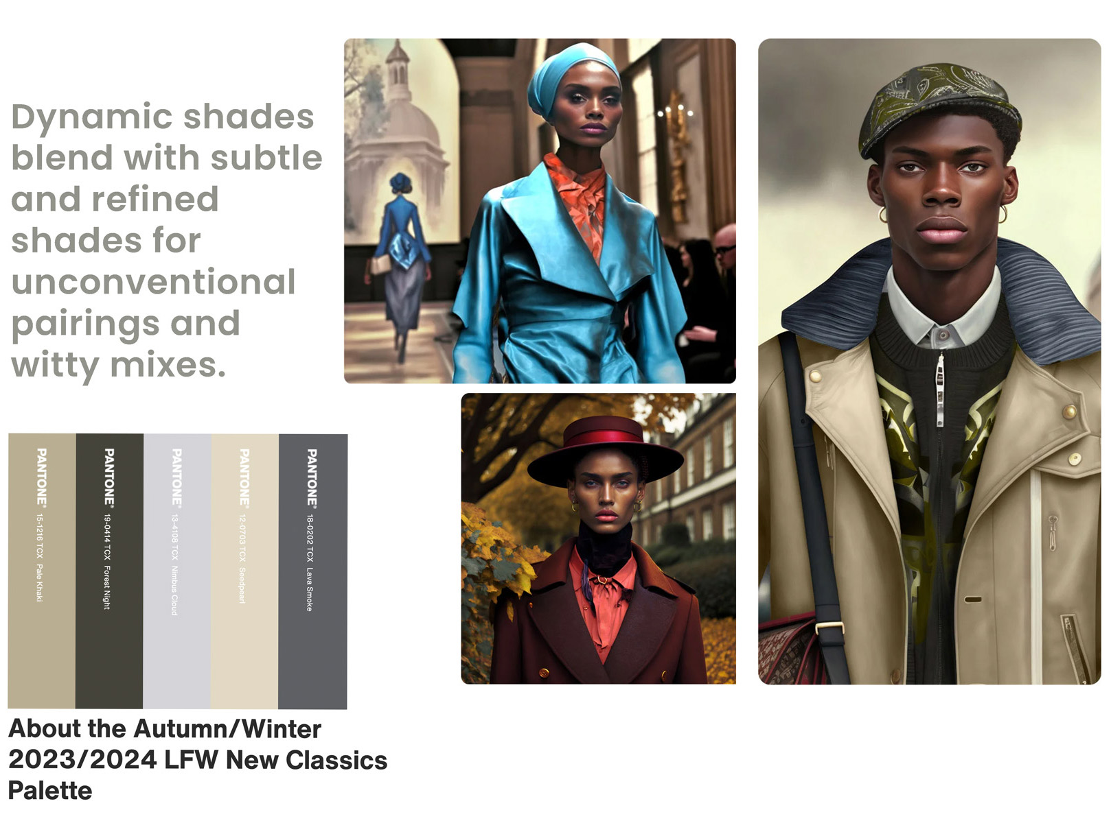
“The free-spirited assemblage of colour featured in London Fashion Week Autumn/Winter 2023/2024 abolish limitations and propel us into novel realms. Reflecting a focus on unique personalisation and our desire to break free, this season’s colours rejoice in individuality and creativity, blending our need for vibrant, joyful colour that actively vies for attention with essential, yet refined subtle timeless tones. Celebrating a sense of freedom, spontaneous colour expressions, and unorthodox colour pairings, these chosen colours expand our understanding of colour, driving us toward a new openness and promoting a message to stay true to oneself.”
– Pantone –
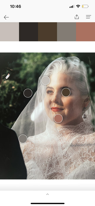
USEFUL TOOLS TO CREATE PALETTES

Colour theory
Colour theory
is the study of how colours work together and how they can create different effects.
Let’s explore some important points

Colour Wheel:
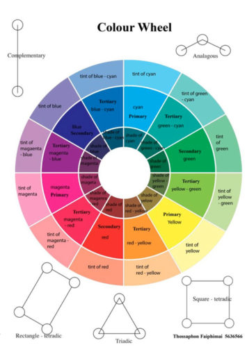
The colour wheel is like a rainbow circle that shows all the colours. It starts with three primary colours: red, blue, and yellow. When we mix them together, we get secondary colours like orange, green, and purple. Mixing primary and secondary colours gives us even more colours.
Colour Harmonies:
Colour harmonies are combinations of colours that look good together. There are different types of harmonies, like complementary colours (colours that are opposite each other on the colour wheel), analogous colours (colours that are next to each other), and triadic colours (three colours that are evenly spaced on the colour wheel). These harmonies help us choose colours that go well together in our artwork or designs.
Using Colours in Art and Design: Artists and designers use colour theory to make their work more interesting and appealing. They think about how colours make people feel and how they can create a certain mood or atmosphere. They also consider things like contrast (the difference between light and dark) and balance (making sure colours are distributed evenly) to create a pleasing composition.
Colour psychology
is the study of how colours can affect our feelings, actions, and thoughts. It explores the idea that colours have the power to make us feel certain ways and influence our moods.
Colours and Emotions:
Different colours can make us feel different emotions. For example, red can make us feel energetic and excited, while blue can make us feel calm and relaxed. Think about how you feel when you see different colours and how they might affect your mood.
Personal Preferences:
We all have our own favorite colours and colors that make us feel good. These preferences can be influenced by our personal experiences and backgrounds. Think about your favorite colour and why it makes you feel happy or calm.
Using Colours Wisely:
When we use colours in design or communication, we need to consider the message we want to convey and the emotions we want to evoke. For example, if we want to create a peaceful atmosphere, we might use soft, cool colours like blue or green. It’s important to think about the context and what emotions we want to bring out.
Remember, colours have a powerful impact on how we feel and behave. By understanding colour psychology, we can use colours in effective and meaningful ways in our projects and everyday lives.
SHARE WITH US YOUR OWN EXPERIENCE WITH COLOUR PALETTES & CREATIVE PROCESS
We are happy to share what we learn to inspire you, challenge your creativity and enjoy this part of the process of your job. We want to see our own experience and help inspire others! Share your palette by using the #tramontinacollection or submit to hello.alice@graphistudio.com


